The chart
Weather-map symbols
Fronts, pressure, boundaries, wind, and the grammar of a weather chart.
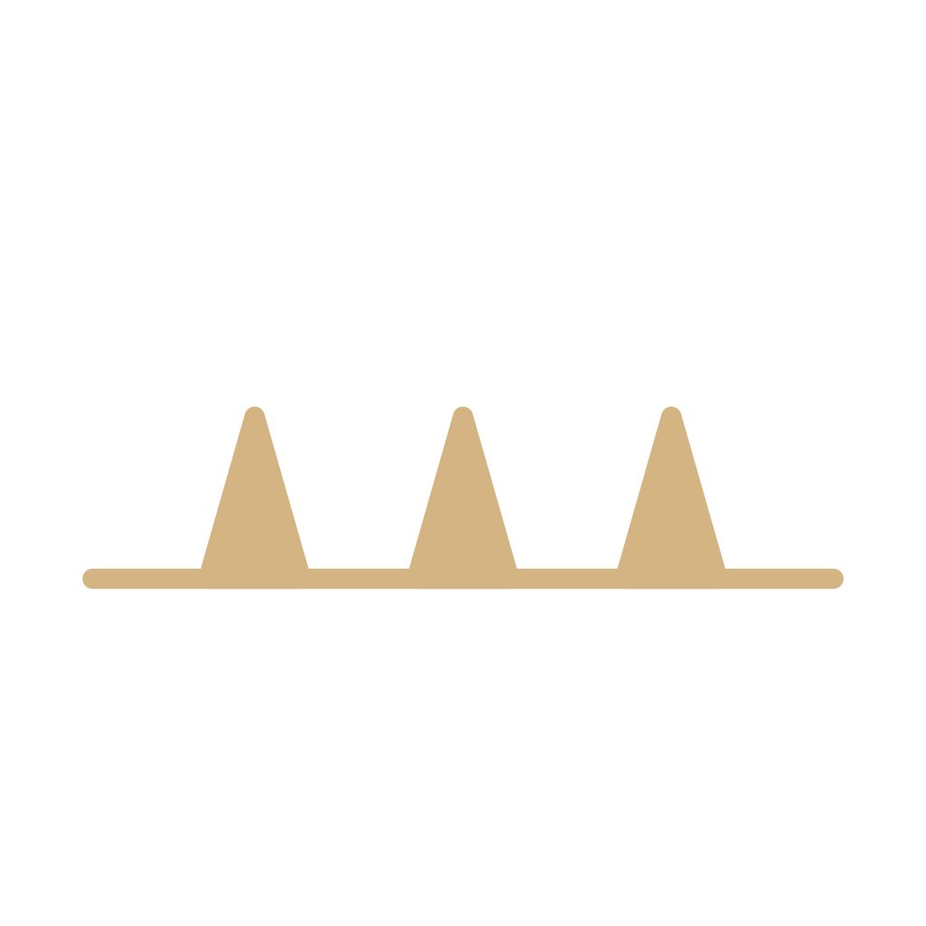
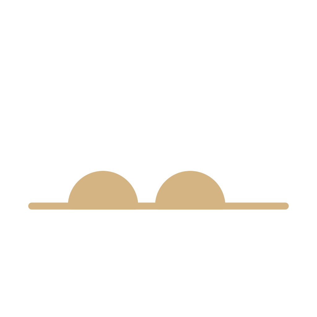
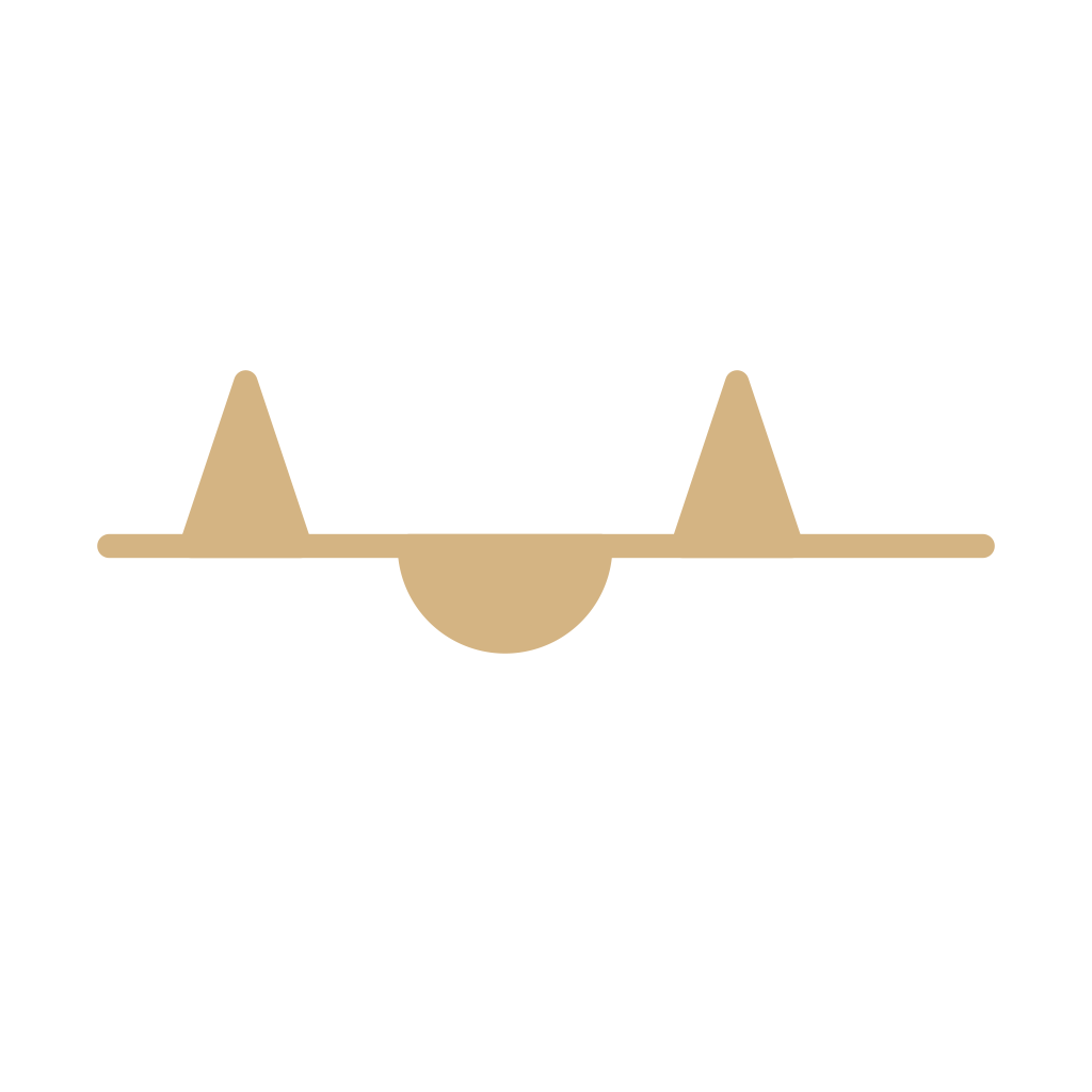
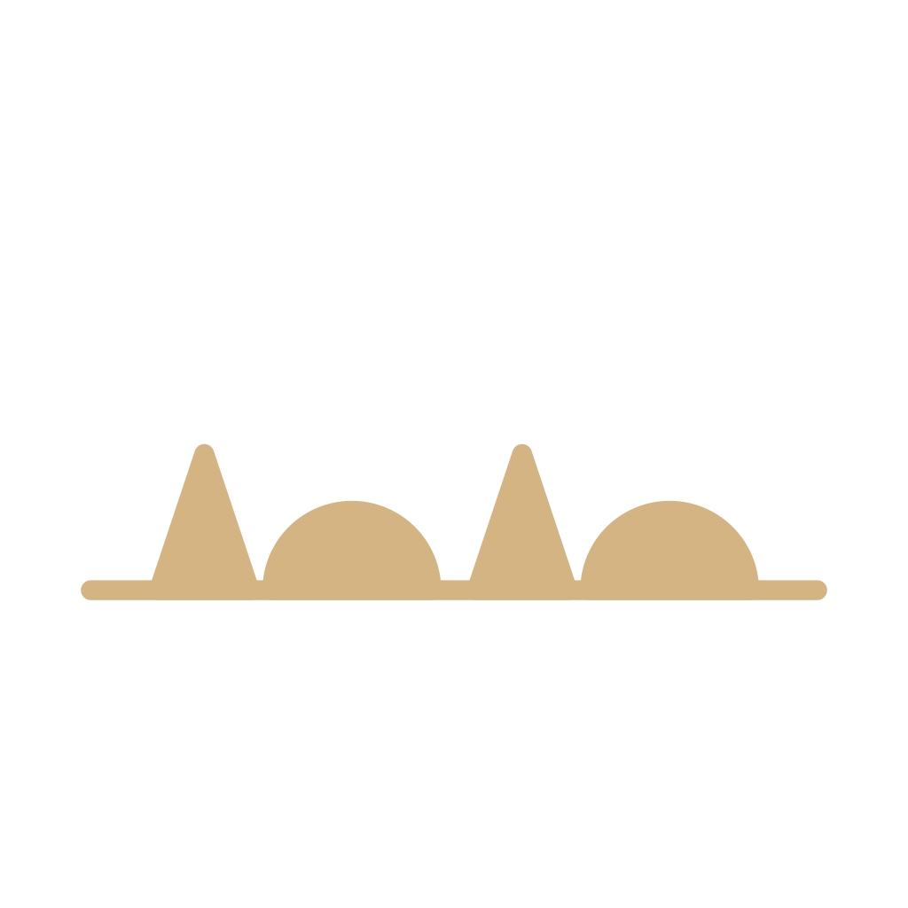
A weather map is a grammar of boundaries and pressure, not a row of sky icons. NOAA’s JetStream lesson draws a cold front as a line with triangles pointing where it is moving, a warm front as a line with half-moons, a stationary front with the ornaments on opposite sides, and an occluded front with triangles and half-moons on the moving side. Those lessons also use color: blue, red, and purple. Color is a publisher’s aid. The shape still has to work in one ink, which is how these drawings are made. NESDIS teaches the pressure centers as a blue H and a red L. The letters are the mark. The color is not the only cue. A trough, JetStream says, is an elongated area of lower pressure and not an air-mass boundary. A dryline, in the National Hurricane Center’s glossary, is a dewpoint boundary drawn with scallops toward the moist air. An isobar is a line of equal pressure, not a front. Precipitation painted across a state is a map habit. It is not the same object as a rain icon on a phone.
Triangles, half-moons, letters, and dashes survive in black ink. The blue and the red are a lesson’s coloring. A reader who only learned the color has not learned the front.
Start here. Cold front. The cold front is the map mark people recognize, triangles and all, and the page separates the shape from the color.
- 1Cold frontA line with triangles in the direction of motion. Cold air is advancing. The color is a publisher’s aid.
- 2Warm frontA line with half-moons in the direction of motion. Warmer air is advancing.
- 3Stationary frontA front that is not moving. Ornaments sit on opposite sides of the line.
- 4Occluded frontA front that has caught up. Alternating triangles and half-moons share one side of the line.
- 5High pressureAn H for a high-pressure center. The letter is the symbol. Color is extra.

- 6Low pressureAn L for a low-pressure center. Not a rain icon, and not a cold front.
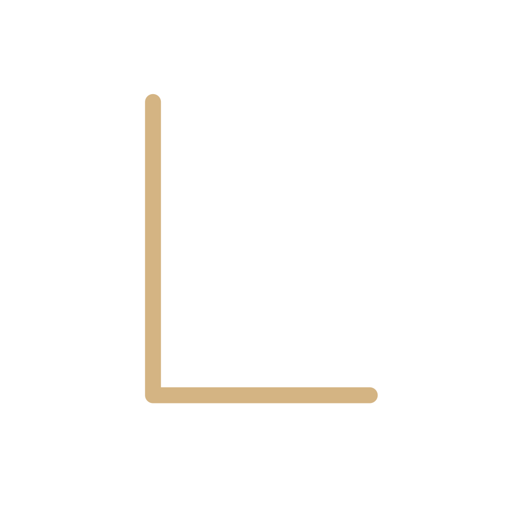
- 7DrylineScallops facing the moist air. A moisture boundary, not a cold front.
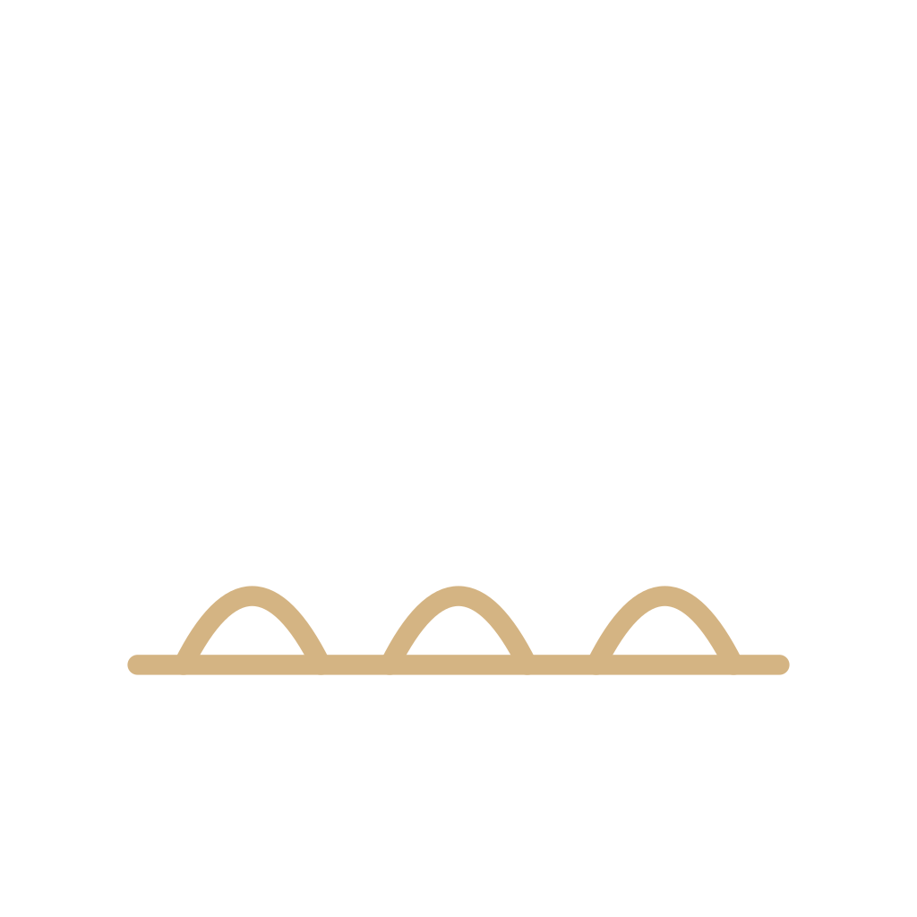
- 8Squall lineA line of thunderstorms. The ticks on this drawing are a reading aid, not a required ornament.
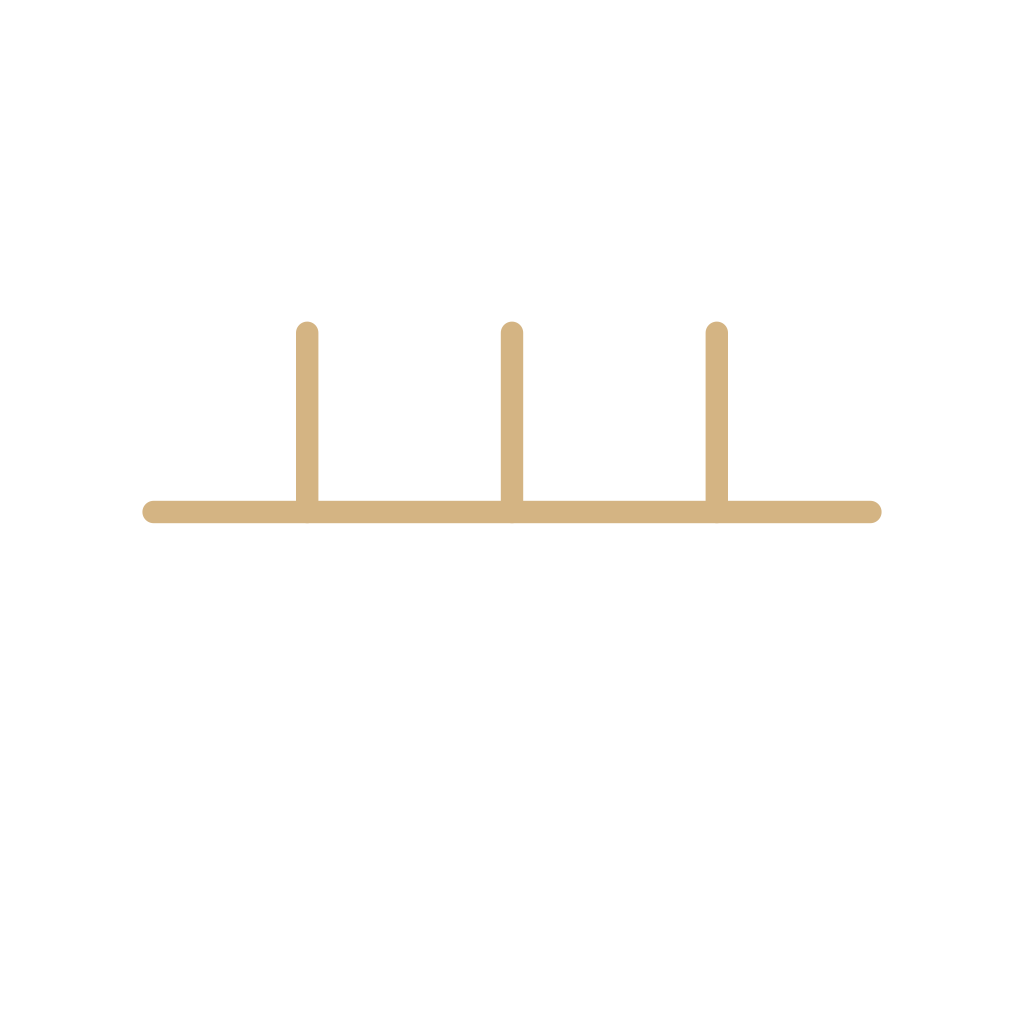
- 9TroughElongated lower pressure and a wind shift. Not a front. The dash is a common habit, not a second alphabet.
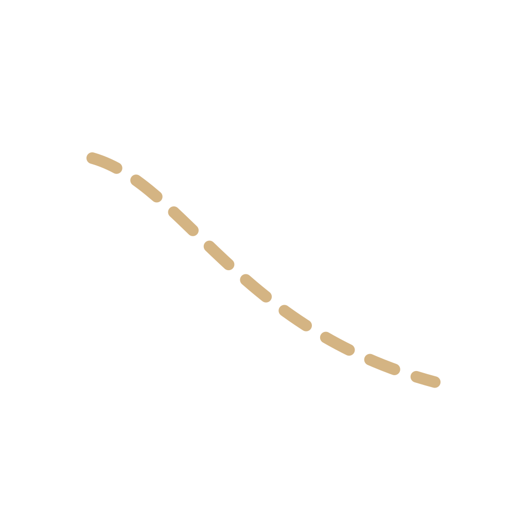
- 10RidgeElongated higher pressure. The zigzag is a reading aid, not a WMO code.
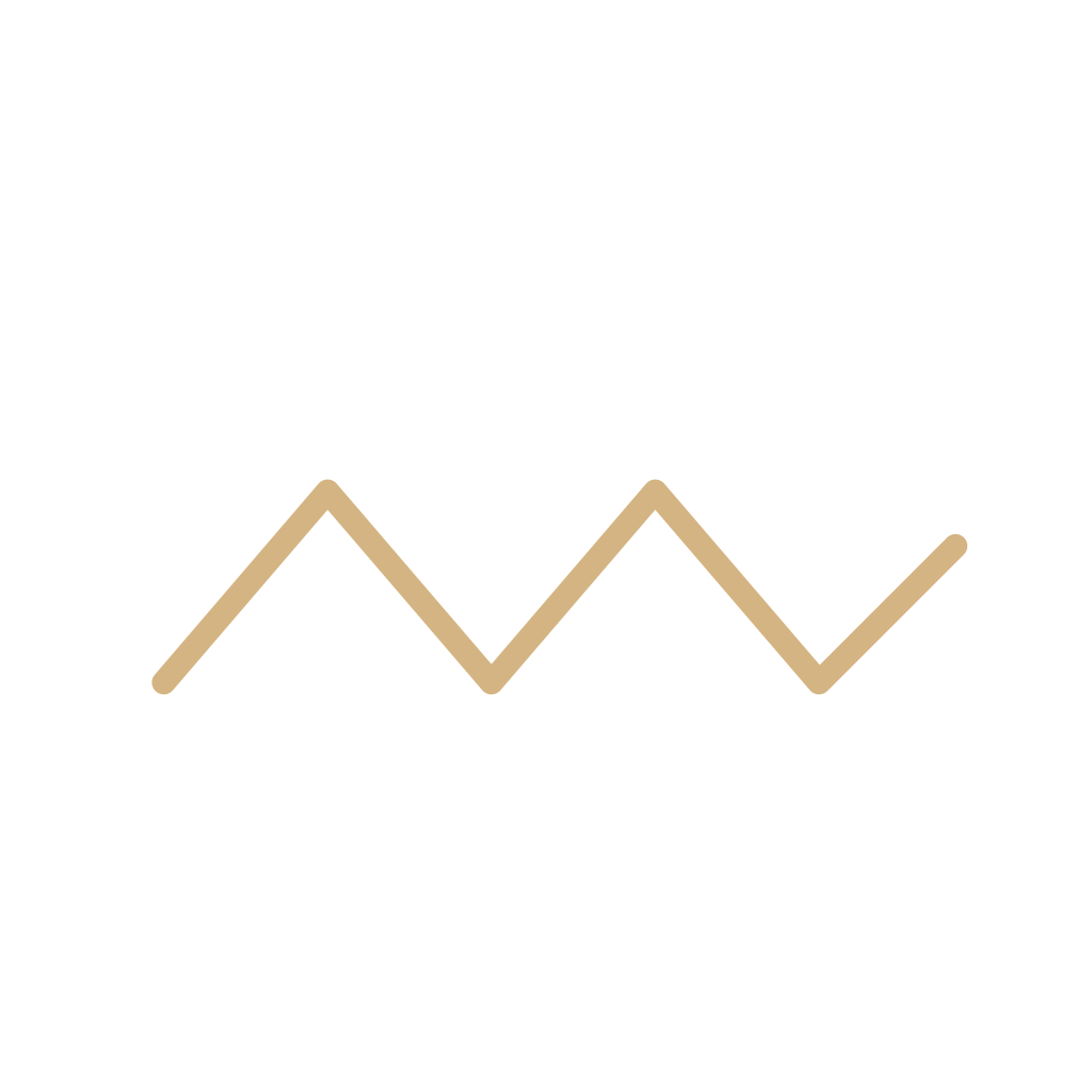
- 11IsobarA line joining equal pressure. The number is the pressure. The line is not a front.
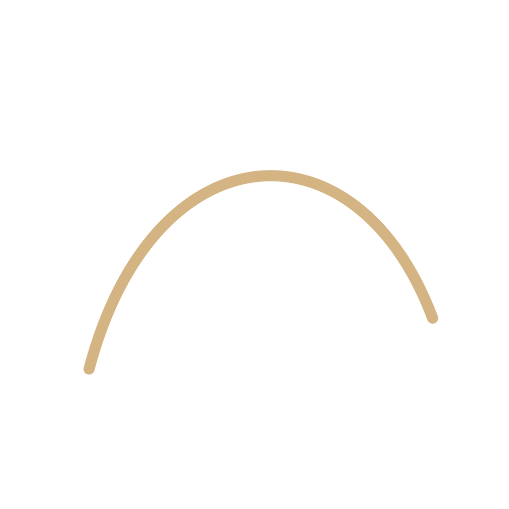
- 12Wind barbStaff, barbs, and pennants: where the wind came from, and how fast. Not a forecast wind icon.
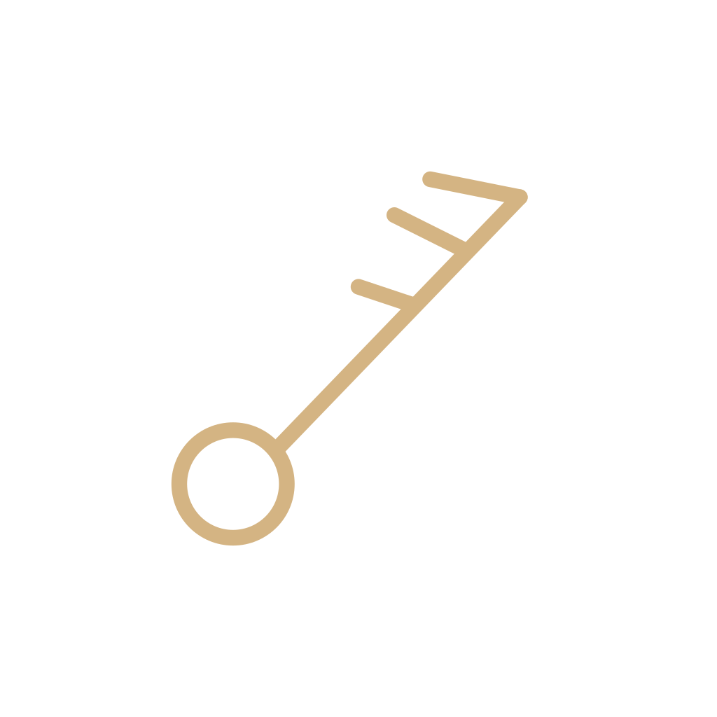
- 13Map precipitationRain or snow painted on a map as an area or a word. Not a rain icon, and not a front.

Questions
What are the main weather map symbols?
The main marks on this line are the four fronts, the high and the low, the trough and the ridge, the dryline, the squall line, the isobar, and the wind barb. They describe systems and boundaries. They do not describe the sky the way a forecast icon does.
Do front colors mean the same thing on every map?
No. NOAA lessons use blue for a cold front, red for a warm front, and purple for an occlusion, with triangles and half-moons as the shapes. Another publisher can change the ink. The shape is the part these pages treat as the mark. Do not rely on color alone.